Back to blog
Lewis Warren
Performance
How to Optimize Your Images and Turbocharge Your WordPress Site Performance
If your site performance is poor, there’s a good chance that your images are a large part to blame. Images contribute to the overall page size, increasing the load time experienced by the user. Each image also requires a separate HTTP request, meaning that using many on a single page will undoubtedly slow down the load time.
A slow site may seem like an inconvenience, but there’s a very good chance it’s also causing your users to bounce and ultimately harming your conversion rate. Worst of all, a poorly-optimized site may be penalized by search engines, negatively affecting your search ranking.
It also impacts the accessibility of your site, as bloated images will dramatically increase load times, making pages more difficult to download for users with slow internet connections. Browsing your site will also be more expensive for mobile users that have a data allowance.
This post provides a checklist of things to consider to ensure your images are optimized and served correctly. We will also touch upon how you can use DeploymentHawk to help you identify and stay on top of images that require optimization.
Improving the performance of your WordPress site often requires a lot of trial and error, however fixing how you use and serve your images is usually one of the easier things to resolve and will often yield big improvements.
#DeploymentHawks Image Optimization Checklist
#Serving Compressed Images
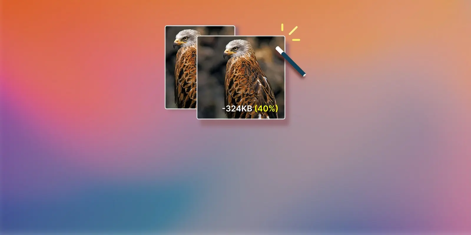
If you’re not serving compressed images, then this should be your first order, as it will undoubtedly get you the most performance gains right off the bat. Compression doesn’t necessarily mean a reduction in image quality. There are many tools out there capable of applying heavy compression to images without there being any discernible reduction in quality, not to the human eye anyway. You can expect anywhere between a 10-80% reduction in file size depending on the image, and even more in some cases.
 If you build your assets via the command-line, we recommend adding a compression layer using packages such as Imagemin, ImageOptim or Mozjpeg, so that this is taken care of automatically.
Alternatively, if your site is powered by WordPress there are many plugins such as EWWW Image Optimizer, Smush or Imagify that will automatically compress your images upon upload.
Whilst this could be a whole article in itself, we recommend being mindful over using too many plugins to achieve tasks like this. Ironically, poorly-optimized WordPress plugins may harm your site performance in various ways. You can test the impact a plugin is having on your WordPress site by running an audit before and after enabling a plugin, and then comparing the results.
There are also sites such as TinyPNG that will also allow you to bulk compress images manually via their site.
#Serving Images in Modern File-Formats
The web is a much more accessible place than it used to be, and serving your images using modern file formats can help you reduce your page load time even further.
AVIF and WebP are the two most popular of these formats and are widely supported on all major browsers. If for some reason you need to support Internet Explorer, you will have to provide a fallback.
The AVIF format offers very efficient lossy and lossless compression and is often reserved for photographic images that require high-fidelity and color accuracy. AVIF files can also handle animations too.
The WebP format is more versatile and can be used for a wide-range of images. Its versatility makes it a more popular image format and if you’re unsure over which file type to use, opt for WebP.
Similarly to step one in this checklist, if you build your assets via the command-line, we recommend converting your images to modern formats before applying compression.
WordPress plugins such as EWWW Image Optimizer can also convert your images to WebP automatically on upload.
There are also many sites that will manually convert your images to modern formats, such as Squoosh.
These first two steps of the checklist will arguably result in the most performance gains. So even if you only complete these two for now, your site performance will be in a much healthier state than it was prior.
Here’s an example of how you can use modern image formats to take advantage of performance gains today, whilst including a fallback image for older browsers.
/* Using the WebP image format with a JPEG fallback */
<picture>
	<source srcset="hero.webp" type="image/webp">
	<img src="hero.jpg" alt="Hero Image" width="800" height="600">
</picture>
#Defer Loading of Off-Screen Images
When a user visits a page on your site, it will attempt to load all of your images and assets at once as different HTTP requests. This can take quite a while to complete if you are serving a lot of images, decreasing the user-experience. Luckily, there’s an easy fix to this problem.
You can defer images so that they load only when they are needed. If you’ve heard the term lazy-loading before, this is essentially the same thing. Rather than load all images at once, we load them as they are about to enter the viewport. This can have a dramatic effect on your page performance and it means that when the user loads a page on your site, only the images that they will immediately see above the fold will download as a HTTP request.
Deferring is a recommended practice to all your assets including files such as videos and JavaScript. For the purpose of this article, we’ll strictly stick to discussing images, but it’s definitely something worthwhile to consider.
You can use the loading attribute on your images to defer them:
<img src="/assets/images/test-image.webp" loading="lazy" alt="a test image"/>If you’re a WordPress user, your images will be lazy-loaded by default if you’re using version 5.4 or higher. If you’re using an older version of WordPress, there are many performance based plugins that will allow you to do this by simply turning on a setting. We highly recommend Perfmatters, an excellent and lightweight plugin that will unquestionably enhance the performance of your WordPress site.
#Serving Images at the Right Resolution and Dimensions
It’s important to make sure that the images you are serving are practical in terms of their resolution and dimensions. If your blog container has a width of 800 pixels, and you insert an image that’s 2500 pixels wide, then that’s a real waste of file size and will add excessive fat to your overall page load.
The image will be forced to shrink down to 800 pixels width so that it renders at the correct size anyway, but behind the scenes the image will still be 2500 pixels wide and bloated for this particular use-case.
As a result, it’s important to consider the resolution and dimensions of every image based on the context of where it is used.
We also highly recommend specifying the dimensions (width and height) of your images in HTML to allow browsers to allocate space for them during page layout, preventing layout shifts and optimizing rendering performance. For example:
<img src="/assets/images/test-image.webp" loading="lazy" alt="a test image" width="800" height="600"/>#Serving Responsive Images
You can leverage the srcset HTML attribute to serve responsive images that adapt to different screen sizes and resolutions. If you have a 1600 pixel wide photo on your homepage, then it arguably doesn’t make sense for the user to download this very same image on a mobile device where the screen width is far lower.
It’s also important to remember that desktop users are likely to be using a more reliable internet connection at home or in the office, whereas mobile users will experience more variability when it comes to connection speed.
As a result, it’s a good rule of thumb to ensure that your site is optimized as much as possible on mobile devices, and serving responsive images will ensure the browser fetches the most suitable version based on the user's device. It can be a primary factor in having a healthy conversion rate.
Here’s the srcset attribute in action:
<picture>
	<source srcset="/assets/images/test-image-small.webp" type="image/webp" media="(max-width: 400px)">
	<img src="/assets/images/test-image.webp" loading="lazy" alt="a test image" width="400" height="300"/>
</picture>
In the above example, the smaller more-optimized version of the image will be served until the viewport is at least 400px in width.
As with most of the other points in this checklist, there are various packages that can be used to generate responsive versions of your images automatically. If you’re a WordPress user, responsive images will be generated automatically if you’re using version 4.4 or higher. If for some reason you’re using an older version of WordPress than this, there are plugins that can generate them for you.
#Using a CDN To Serve Images
It is highly recommended that you use a CDN (Content Delivery Network) such as Cloudflare’s offering to serve your images and assets. This means that your assets will be delivered from servers located closer to each user's geographical location, resulting in a reduced latency and faster load times. Serving images via a CDN will have the added advantage of reducing your server's bandwidth consumption.
#How DeploymentHawk Can Help
We understand that it’s very difficult to monitor the optimization of all images on your site. Inevitably some will slip through the cracks, and working in large teams or on asset heavy websites will make this process even more challenging.
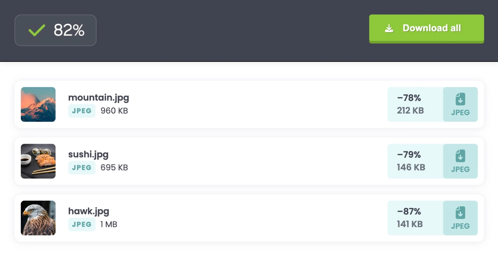
DeploymentHawk carries out a performance audit of your site on every code deployment, meaning those poorly-optimized images will never slip through the cracks again. We generate a detailed report on every audit, documenting how your site performance, accessibility and SEO has changed, as well as identifying the culprits.
Why not give DeploymentHawk a try and run an audit on some of your key pages to see how healthy your WordPress site performance is? We offer a 14 day free trial and recommend enabling automated audits as well as slack notifications (discussed below) to truly see how valuable a tool like this can be when used as part of your deployment process.
You’ll never have to worry about monitoring your site performance again. DeploymentHawk will notify you of issues automatically, as they occur.
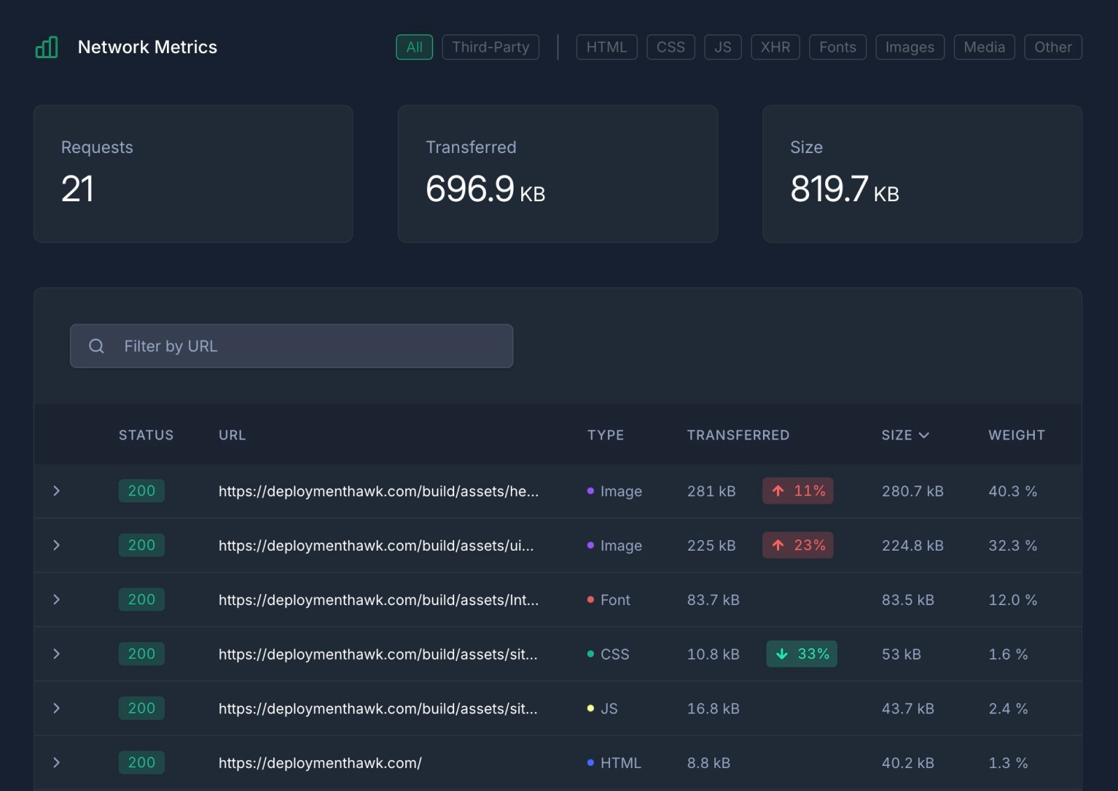
#Checking Network Requests
Inside of each report, the network requests table shows you which images and assets are affecting the size of your page load. We also display which assets have increased in size since your last code deployment.
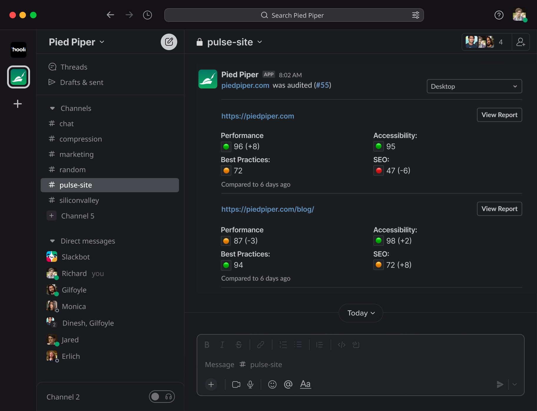
#Slack Integration
DeploymentHawk’s Slack integration provides you with an instant notification when fresh code is deployed to your site. This is particularly useful when working within a team or giving a client access to a site. This gives you peace of mind that if someone else uploads a poorly-optimized image or asset to the site, you’ll be notified instantly right inside of Slack.
#Conclusion
If your site performance isn’t up to scratch, ensuring that your images are properly optimized should be one of your first priorities. It can be the difference between a page that loads slow and a page that loads fast. If you’re running a WordPress site, you can take advantage of the plugins mentioned above that make optimizing your images that much easier. Incredibly, there are tons of sites out there that apply no image optimization at all, resulting in pages that are megabytes heavier than necessary. By following this six-point checklist, you’ll be ensuring that images are truly optimized, giving you the best chance of having a site that’s super-speedy for your users.
Like to add something? Join the discussion on Twitter.