Back to blog

Tom Rankin
Performance
How to Improve Your Mobile Lighthouse Score
Small-screen internet browsing is now in the majority, so a mobile-first approach should be a priority for your site. Google Lighthouse is a modern and fantastic way to monitor the performance of your site, and is essential for smaller viewports. As such, learning how to improve your mobile Lighthouse score can reap rewards in a number of areas.
For this post, we’ll look at how to improve your mobile Lighthouse score. However, we’ll also cover why you may not need to do this as a priority, and the situations it can apply to.
#Why a Mobile-First Approach to Site Design Should Be Top of Your List
Mobile devices are an integral part of our lives in almost every area. Given that users access the internet through smartphones and tablets more than ever, you have to prioritize mobile optimization for a seamless User Experience.
 A mobile-first approach shouldn’t be only a preference now, but a necessity. Here are a few compelling reasons why:
The user’s expectation is that mobile sites will load fast, be easy to navigate, and provide pleasing visuals.
Search engines (including Google) emphasize the importance of an optimized mobile site. Google's indexing means that the mobile version of your website takes priority in Search Engine Results Pages (SERPs).
Mobile-first design can boost your accessibility, primarily down to its adaptation to various screen sizes and resolutions. This inclusivity lets all users access and navigate your website.
Websites optimized for mobile tend to have faster load times, reduced data usage, and improved overall performance.
Combined, a mobile-focused design for your site will impact performance in a positive way. Of course, these factors also could improve your mobile Lighthouse score too, if you implement them in the right way.
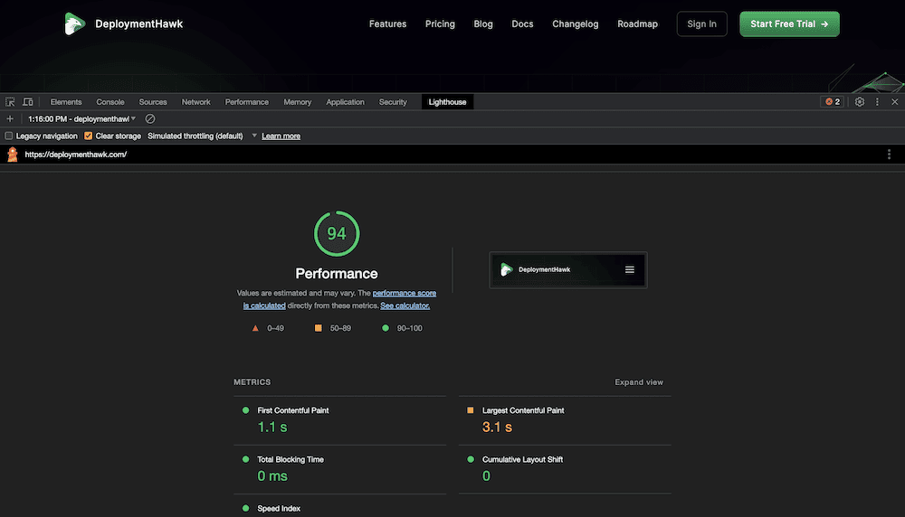
#How Google Lighthouse Calculates Mobile Site Performance
When it comes to measuring site performance in general, Google Lighthouse considers several key factors to generate its scores and recommendations. It’s worth noting that there is no difference between the Mobile and Desktop audit types, but we’ll talk about this in a later section.
Even so, one crucial metric that Lighthouse evaluates is First Contentful Paint (FCP). This helps the perception of speed, as it analyzes how long it takes for the user to see the first piece of on-page content – text, images, <svg> tags, and <content> tags.
The Speed Index has some subtle differences to FCP. In this case, it measures how fast content displays. However, both FCP and Speed Index only represent about 20 percent of the total audit score.
For mobile performance, you should look to Core Web Vitals. These are quality markers that let you gauge a ‘real-world’ look at your site, especially on mobile:
Largest Contentful Paint (LCP). This is a good way to assess perceived loading speeds, as it tells you when the largest piece of on-page content loads.
Cumulative Layout Shift (CLS). This measures visual stability, specifically how your layout shifts around as different elements load on the page.
First Input Delay (FID). You’ll see a metric here measured in milliseconds. It analyzes how long it takes for the page to let users interact with it after they press a button (or similar).
However, there are more factors that affect site performance away from number crunching. In the next section, we’ll talk about why your mobile Lighthouse score might not be as accurate as you think.
#Why You Might Not Need to Worry About Your Mobile Lighthouse Score Too Much
You can look to implement all of the advice we give later on, yet still see a poor Lighthouse score for your mobile site. This can be frustrating, but there’s one big reason for it: network speeds.
Most of the connections we see (that aren’t Wi-Fi) are either 4G or 5G. Given the amount of data that these connections push around, you can even find they get slow from time to time. It’s also worth pointing out that a vast majority of the world has access to 4G networks. However, Google Lighthouse simulates a ‘flaky’ 3G network instead.
While you can change this within Lighthouse’s config files, the default isn’t representative of most mobile users. In fact, if you look at statistics for many leading e-commerce retailers, you see that almost none have a good mobile Lighthouse score.
There are a few other subjective concerns when it comes to mobile Lighthouse scores too:
Lighthouse scores consider performance metrics that may not always align with your specific target audience or their browsing habits. This means you’ll want to prioritize UX over anything else.
While Lighthouse scores are closer to real-world conditions than ever before, it’s still a ‘lab’ test. Factors such as network connectivity, device capabilities, and user behavior can impact actual performance.
As with any metric assessment tool, Lighthouse’s audits do not define the success of a website. It focuses on specific technical aspects and may not capture the full breadth of user satisfaction or business goals.
Technology and web standards evolve all the time. Instead of chasing a specific Lighthouse score, follow web performance guidelines to help regularly evaluate and improve your site.
The rest of this article will look at those current web standards, specifically how you can improve your Google Lighthouse score for mobile devices.
#How to Improve Your Mobile Lighthouse Score (5 Tips)
There are a number of ways to improve your mobile Lighthouse score, and the list we give here is in no particular order.
However, our first of five tips should be your overall goal for good mobile audit scores. Let’s start there.
#1. Load Your Content First
To improve your mobile Lighthouse score and enhance the performance of your website, you should prioritize loading your essential content. This is where your Core Web Vitals come into play, although you should focus on any metric that analyzes ‘paint’:
First Contentful Paint
Speed Index
Largest Contentful Paint
As such, the Performance Audit will be key for a good mobile Lighthouse score. Any audit, metric, or opportunity that helps you to load content faster is going to help.
 There are some related concepts that you may want to consider for better scores too:
Identify resources that are crucial to render content, such as HTML, CSS, and JavaScript files. Minification and compression will help to reduce file size and improve loading speeds.
Visible content in the initial viewport should load fast. You can optimize and prioritize loading these elements through techniques such as inline CSS and font preloading.
You should set appropriate cache control headers to help optimize and speed up your site too. If you’re a WordPress user, there may be options within your plugin’s settings.
Once you make loading your content a priority, you can move onto other areas.
#2. Script Loading and Preloading Styles
Optimizing script loading and preloading styles can significantly improve your mobile Lighthouse score. Both techniques ensure that you load scripts in an efficient way and prioritize stylesheets. Both can enhance performance and your audit scores.
Your script loading order is important, yet will be a straightforward implementation within any code:
<script defer src="file.js"></script>
<script async src="library.js"></script>
This will help when it comes to render-blocking scripts. Any non-critical scripts should go to the bottom of the HTML, or use the right attribute – either defer or load. This lets the browser render the page while scripts load in the background.
It’s also worth using lazy loading for scripts that are not essential for initial page functionality. This lets you load scripts only when they are needed, such as during user interactions or when certain conditions are met.
You may want to consider preloading stylesheets. If you choose to load stylesheets before the Document Object Model (DOM) parses, the styles apply at that point rather than later. It’s also simple to implement preloading:
<link rel="preload" href="my-styles.css">This instructs the browser to fetch the critical stylesheets as a high priority resource, and allows for faster rendering and an improved UX.
#3. Static-Site Generation vs Server-Side Rendering
When aiming to improve your mobile Lighthouse score, choosing the right website architecture can play a significant role. A page will generate a blank ‘canvas’ on which the server will paint content. The time between a blank and populated page is crucial, and rendering types can help minimize this timeframe.
Two popular approaches are Static-Site Generation (SSG) and Server-Side Rendering (SSR). SSG generates static HTML files during the build process, which eliminates the need for server-side processing at runtime. This results in faster page loads and improved performance.
On the whole, SSG reduces Time to First Byte (TTFB) and enhances perceived performance. Another bonus is that static sites have better (read: quicker) distribution through a Content Delivery Network (CDN).
SSR lets you render dynamic content on the server. It’s ideal for sites that require real-time updates or personalized user experiences.
One of the big plus points of SSR is how search engine crawlers have an easier time, as the content is readily available in the initial HTML response. This could result in better Search Engine Optimization (SEO).
What’s more, SSR enables interactive features such as form submissions, user authentication, and database access, to be handled on the server side.
Here’s a quick primer on how to choose which rendering type is appropriate for your site:
SSG is suitable for content-focused websites, while SSR is more appropriate for dynamic and interactive applications. If your priority is fast page loads and optimal performance, SSG is generally a better choice.
SSG can simplify development through decoupling the front-end from back-end logic. In contrast, SSR requires more server-side programming expertise.
Ultimately, the choice between SSG and SSR depends on your specific requirements and priorities. Both approaches have their merits and can contribute to an improved mobile Lighthouse score.
#4. Compress and Optimize Your Site’s Images
Image optimization is a crucial step regardless of your goals. Unfortunately, a high-definition image has an impact on your loading speeds and mobile Lighthouse score. The answer is to compress images without reducing quality.
Of course, you need to strike the right balance between file size and visual quality. However, online tools such as TinyPNG can handle this for you:
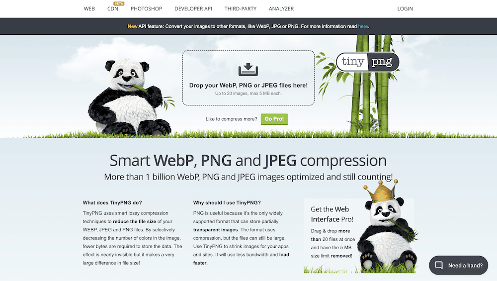 Image formats matter too, and you don’t have to choose between perennial file types JPEG, PNG, and SVG any more. Google’s own WebP provides lossy and lossless compression that performs well compared to other formats.
Responsive image techniques let you deliver images based on the user's device and viewport. Use srcset and sizes attributes to specify multiple image sources and let the browser determine the most suitable one to load:
<img
  srcset="logo-480w.jpg 480w, logo-800w.jpg 800w"
  sizes="(max-width: 600px) 480px,
         800px"
  src="logo-800w.jpg"
  alt="Company logo on a blue background." />
As with other attributes we mention, these are straightforward to implement, and have lots of support within all of the major browsers.
#Conclusion
Mobile web browsing is the main way users will access your site, at least according to the statistics. As such, you will want to pull out all the stops to improve your mobile Lighthouse score for better search results and performance.
However, it’s important to take a realistic opinion of that score, as Google Lighthouse uses a simulated mobile network that many users can outperform. Still, if you load your content as a priority, implement script- and pre-loading, and undertake simple techniques such as image optimization, you’ll see those Lighthouse scores turn green.
If you need to improve your mobile Lighthouse score, DeploymentHawk can be a crucial element in your workflow. There’s a 14-day free trial, with no obligation to purchase after.